Brand
Brand kit
Our logo, colours and type, and how to use them. Everything on this page is free to download for press, partners and members.
01
Logo
The monogram and the wordmark, locked together. The lockup is fixed. Don’t move the parts or change the space between them. It comes in three colourways; use the primary wherever you can.


02
Monogram
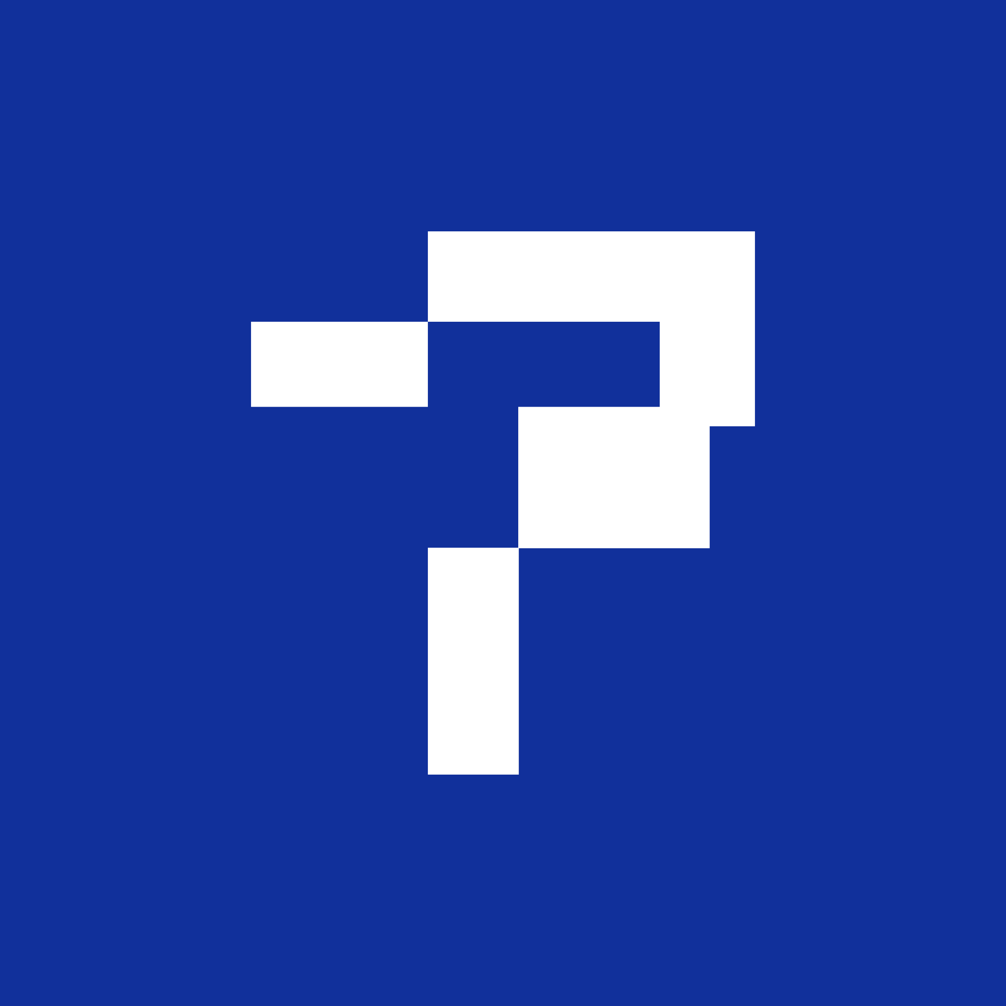
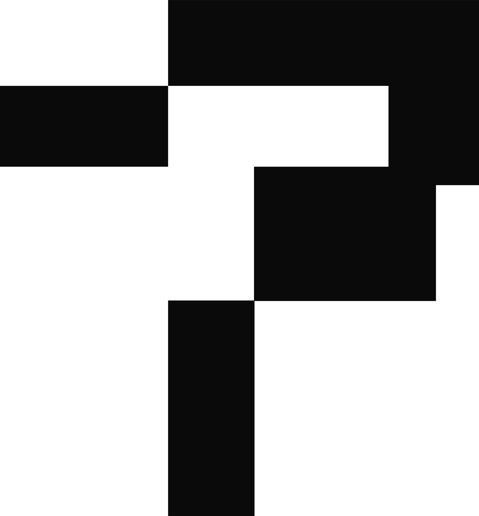
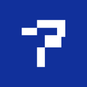
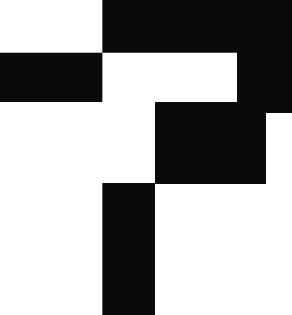
The TFF monogram on its own, for places too small for the wordmark: favicons, avatars, stamps. On social profiles and app icons, use it white on a blue square.





03
Clear space & size
Give the logo room. Keep a margin of at least x on every side, where x is the width of the monogram’s stem. Nothing else (text, edges, other logos) goes inside it.

- Logo, minimum
- 120 px wide on screen · 30 mm in print
- Monogram, minimum
 16 px on screen · 5 mm in print
04
Misuse
Use the files as they are. If something in the kit doesn’t fit what you’re making, ask us rather than altering the logo.
05
Colour
Three colours carry the brand: TFF Blue, ink and paper. The rest do quiet jobs on screen. Click a value to copy it.
- Signal IndigoOn screen only: buttons, links, focus — things you can press.
- MistQuiet surfaces behind panels and specimens.
- RuleHairlines. We separate with rules, not shadows.
- GraphiteSecondary text: meta, captions, labels.
TFF Blue is the brand’s colour; Signal Indigo is the website’s. Print, merch, slides and anything with the logo on it use TFF Blue. Signal Indigo only marks things you can click.
06
Typography
Three typefaces, one job each. All three are free and open source (SIL Open Font License). The downloads are web fonts; for desktop apps, install them from Google Fonts.
- Built on both sides of the corridor.
- Playbooks and real pitch decks, written by people who have done it.
- BANGALORE ↔ SAN FRANCISCO · 35,000+ BUILDERS
07
Style
Four habits keep everything we make looking like it came from the same place.
- 01
The page is printed matter
Everything we make should feel edited, like a publication rather than a startup template. Serif display type, generous margins, and a small mono label above each block.
- 02
Square corners, rules not shadows
Panels and images have square corners, and hairline rules separate things instead of drop shadows. Buttons and tags are the one exception: they’re pills.
- 03
Quiet by default
Mostly ink on paper. Blue is for the logo and for the one thing on a page that matters most. If two things are shouting, one of them is wrong.
- 04
ASCII is our picture language
Our illustrations are 3D forms drawn in characters (the bridge, the coin stack, the hands), in blue or ink on paper. Prefer one of those to stock photography.
08
Our name
In writing, we’re The Founder Folks: three words, capital T, even mid-sentence. After the first mention, TFF is fine. The joined-up “TheFounderFolks” exists only inside the logo.
- ✓ The Founder Folks
- ✓ TFF after the first mention
- ✕ the Founder Folks
- ✕ Founder Folks
- ✕ TheFounderFolks in running text
Need something that isn’t here, or want to check a use before it goes out? Get in touch.